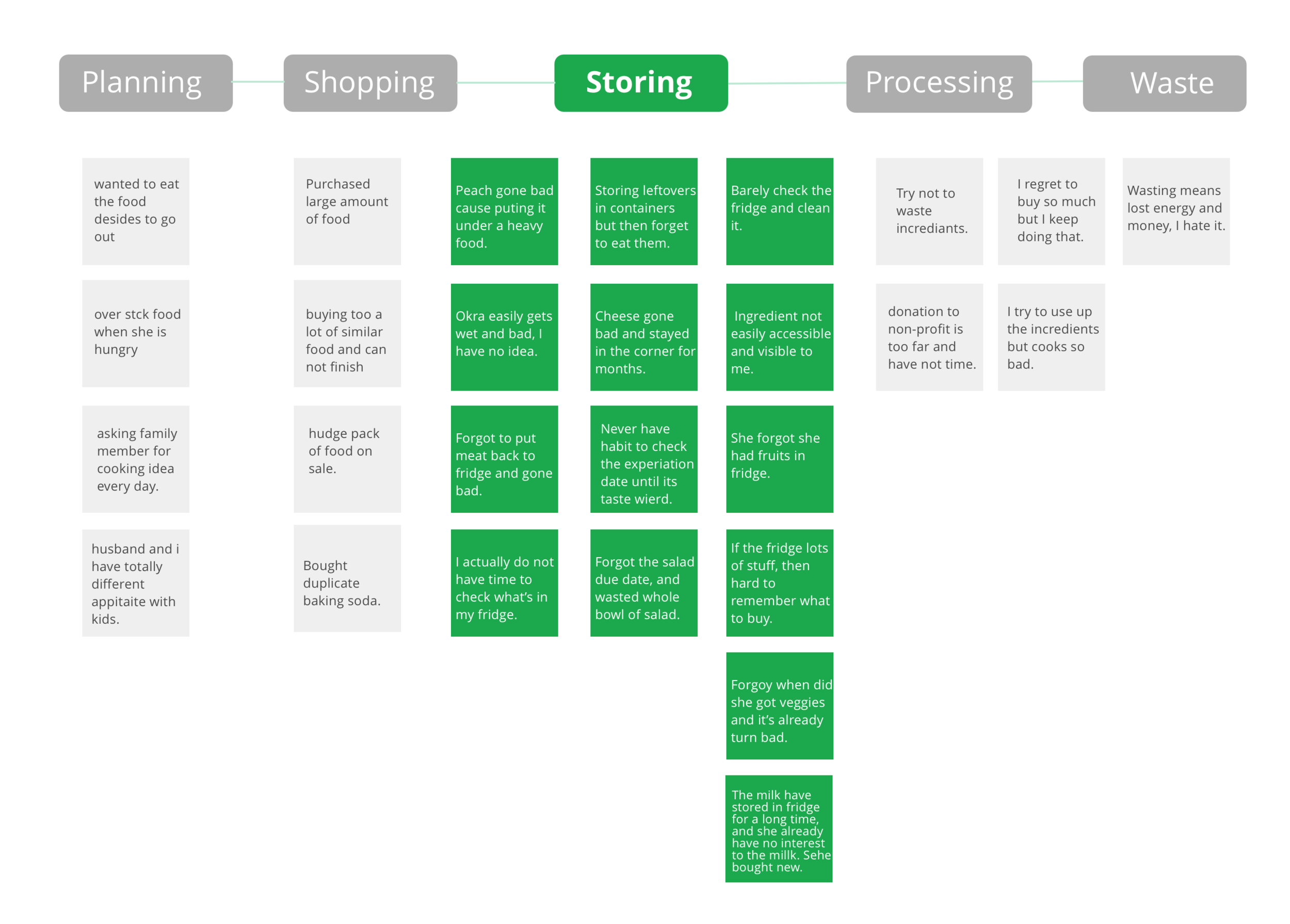
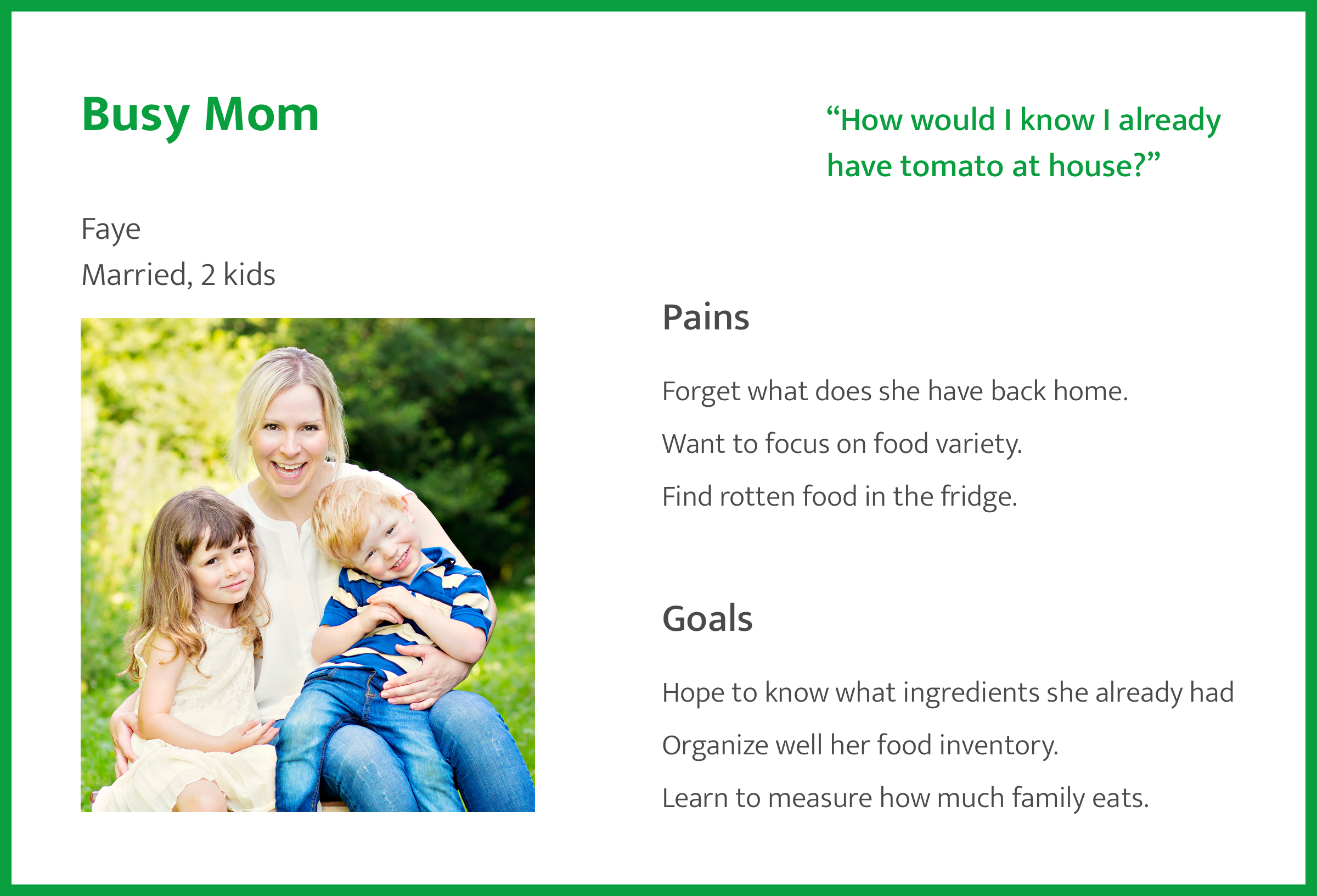
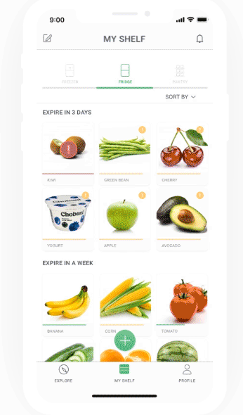
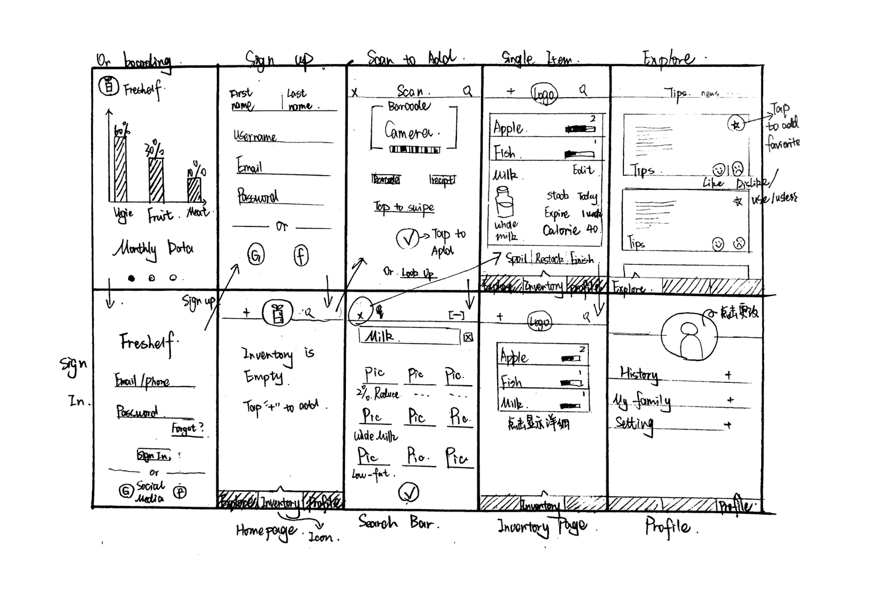
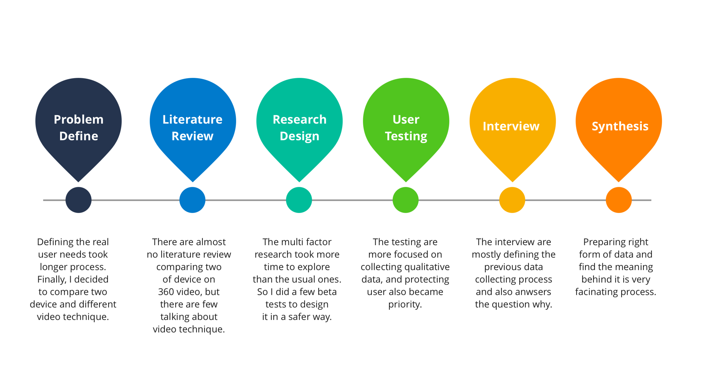
BB&T - Mobile Banking Experience

overview

BB&T Bank is a branch banking company that operates 2,049 branches in 15 states and Washington, D.C. offers consumer and commercial banking, securities brokerage, asset management, mortgage, and insurance products and services. BB&T is named "2016 Javelin Mobile Banking Leader in Functionality".

 
bb&t-mobilebanking-cover.png

Duration:

4 Month

Role:

UX Design and Research

Methods:

Storytelling, Usability Testing, Survey Design, Competitive Analysis, Rapid Prototyping

Tools:

Tools: Powerpoint, Axure, Excel


Introduction

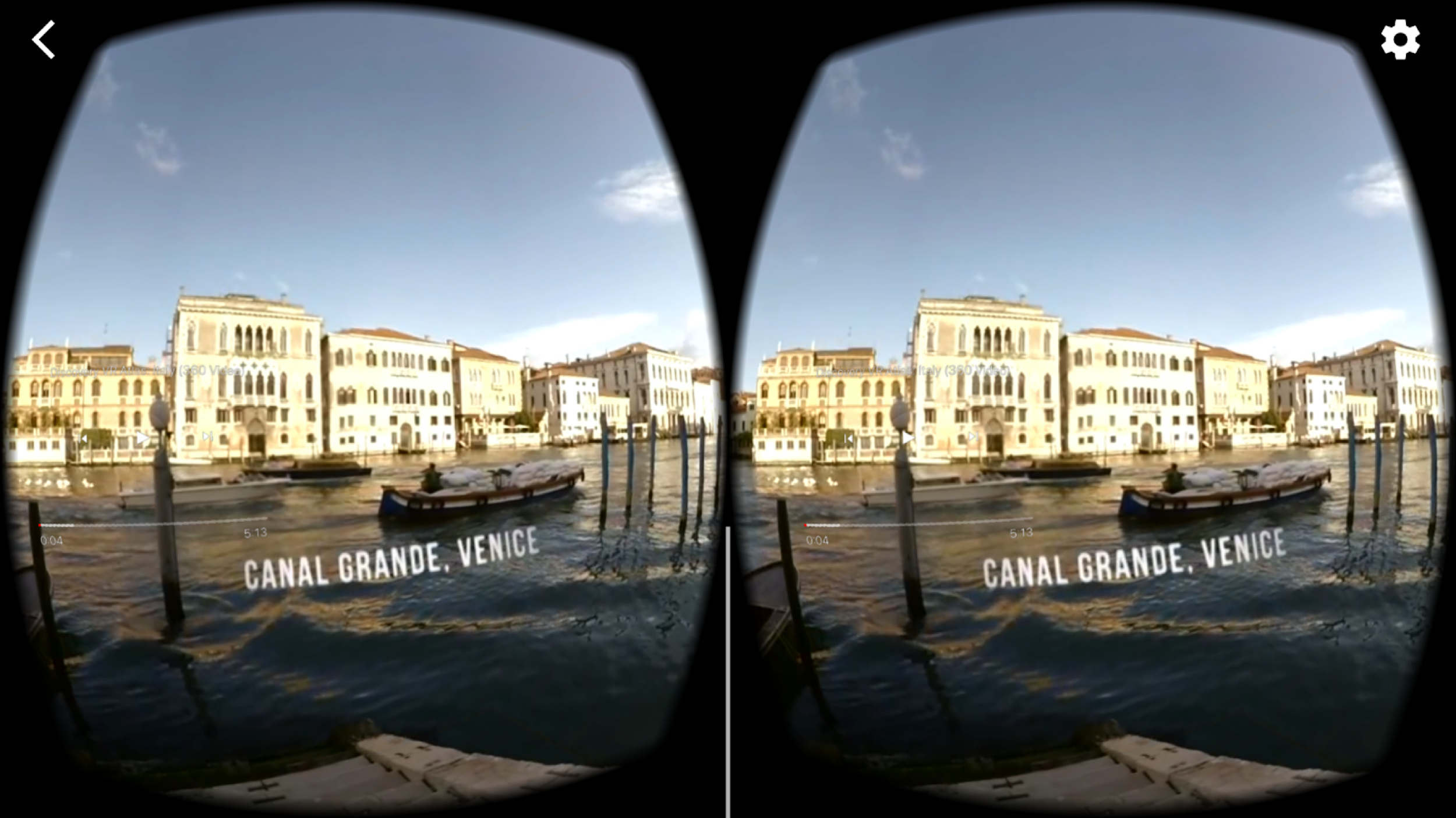
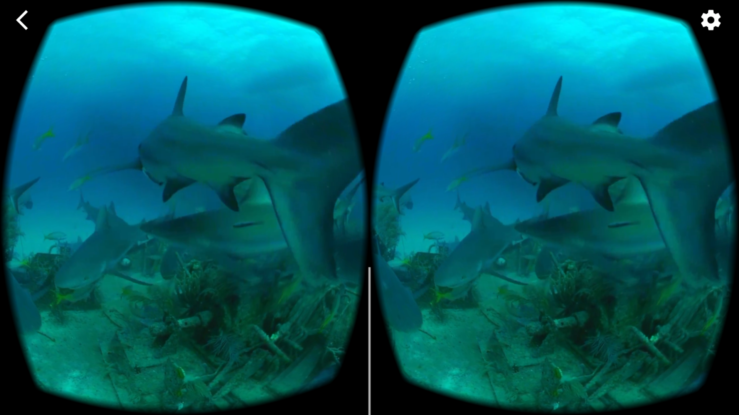
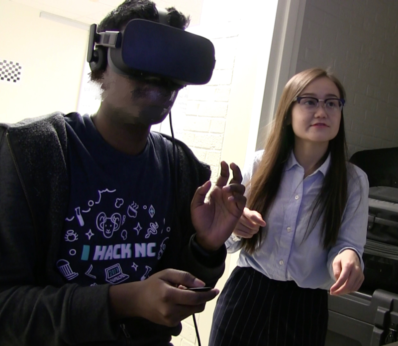
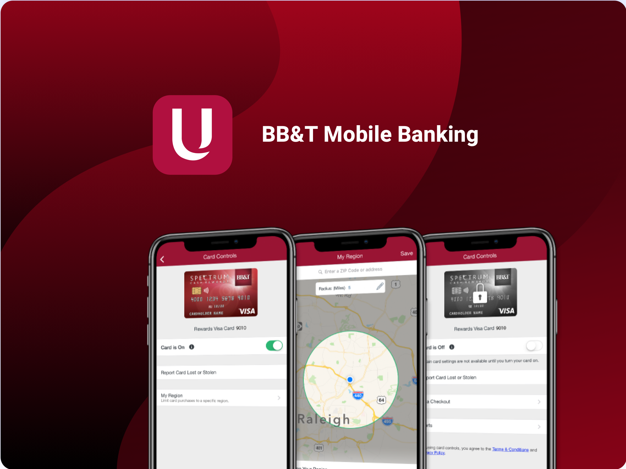
I worked at  BB&T’s Tech Center in Raleigh, NC, as a User Experience Intern with the Human Factor Team for three months where I designed a research survey, analyzed results, accessibility designs, and an unannounced feature.

I took the project from the research stage to the prototyping stage. In the process, I worked closely with several designers, researchers and developers. Special thanks to my mentor Denial Schantz, Miranda Capra who taught me how to think problems to emphasize users to find the insights behind it.

Unfortunately, I am unable to share any specific details about the unannounced feature due to the NDA reason. If you have any questions regarding this project please feel free to contact me.

Card Controls Feature

696x696bb.png
1024x768bb.png
 
Screen Shot 2019-06-10 at 7.07.20 PM.png
 

Team Collaboration

Collaborating with Researchers and Designers

bbt-team copy.png


Freshelf

I worked with a local startup on for their project “Saving Energy, Reduce Waste”. I led a team of 5 to design for the final idea, Freshelf Mobile App which helps customers to reduce household food waste and provides a quick and easy way to manage their food at home.


Duration:

3 Months

Team:

2 UX Designer, 1 Visual Designer, 1 Front end developer, 1 Business Analyst

Tools:

Team Lead, User Research, Ideation, Interaction Design, Visual Design

Deliverables:

Research Findings, Interactive Prototype, High Fidelity Mocks, Specifications, Presentation


Introduction

Food Waste Problem

Food waste is happening at every stage of the food cycle, from planning, shopping, storing, and processing to cleaning. We focused on the issue of food storage to reduce household food waste and maximize the food value.

Food waste has grown 204% since 1960, according to NRDC report.

Screen Shot 2019-06-14 at 2.23.41 PM.png
 

Design Question

prostate.png

The Solutions

Research Informed Solutions

  • Easy food entry

  • Customized food status and storage reminders based on time, space and location

  • Food tips and recipes based on shelf inventories

  • Visualization for food usage and recommendations

  • Add family members to organize together


Design Process

process.png


Discovery

User Interviews

We explored 3 main questions:

  • How do customers shop, store, and manage food?

  • How frequently do they check their inventory?

  • How frequently does the food go bad and how do they deal with it?

Contextual Inquiry

We asked users to think aloud while they shopping, and to record their shopping experience. Also, we walk into visited their homes to observe their food managing management methods.


Competitive Analysis

Based on competitor analysis, we found there are 3 common problems: 

  1. Navigation is confusing and work flow is unclear.

  2. A recorded history of food items is not supported Does not support history for previous food record.

  3. Food storage tips based on what food a user has are not provided Didn’t have combination of food storage tips with how much food do you have.


Findings

Insights from phenomenon

  • The majority of wasted food is fresh

  • The longer food is stored in the fridge, the less desired it is to eat.

  • Customers don’t have time to check inventory.

  • Spontaneous events and plan changes result in extra food in the fridge.

  • Food stored improperly causes waste.

  • Remembering expiration dates brought a high mental load.


Synthesis

Affinity Diagram

Breaking down the big problem and focusing on the storing stage of food waste.

storing.png
 

Personas

We created two different types of personas to distinguish our target audience.


Storyboards

Busy mom’s use case:

  • Popup events

  • lack of food storing knowledge

Single person’s use case:

  • Existing food inventory

  • Unexpected rotten food


Journey Map

We created user journeys for both new and existing customers.

New User:

  • Happy when they see organizing tips.

  • Happy to see recipes

Return User:

  • Happy when they find a way to store food

  • Happy the product allows the family to participate


Ideation

We brainstormed and wire-framed several ideas and we decided to go with a mobile solution because it is portable, accessible and available most of the time.

Goal: Create a quick, easy, user-friendly food management tool.

ideation graph.png
 

Final Design


Structural login and sign in process.

V1 was a simple Sign Up process with a big caption to indicate enter. After user testing, in V2 we decided to add a login process and fewer items on the screen to avoid distracting the user.

logins.gif


Adding in a better and smoother way

V1 was focused on putting the barcode and receipt on scanners together, but 80% of users did not see the function, so in the V2 we decided to separate the two functions and make them stand out.

add.gif


Personalized reminders based on time and location.

Users could receive notifications based on location and time. The default provides 3 notifications around breakfast, lunch and dinner times. Users could customize the reminders based on their own schedules.

explore.gif


Explore tips and articles to boost your food knowledge.

V1 contained a lot of information including users profiles and posts. After research, we decided to focus on sharing useful tips rather than user-generated content, but users still had the ability to comment.

Reminder.gif


Overview of your food history

Our competitive analysis showed that no exciting food management app allows the user to look back on how many foods they have consumed. A clear visualization could help the user better understand themselves.

history.gif

Prototypes

Paper Wireframes


Wireframes

  • Inventory display design and highlights for important information.

summary1.png
  • Three different ways to add items makes adding products easier.

summary2.png
  • Explore food tips and recipes , food purchase and food waste history, and add family members to list.

Summary 3.png
  • Personalized reminders allow users to personalize alerts and notifications.

Summary4.png
 

Style Guides

Consistent Design

FRESHELF DESIGN SYSTEM.png
 

Usability Study

We interviewed 5 people to test our final prototype. We not only received high recommendations from people but also they asked to use the app immediately at home.

“I am a part-time group chef and I had lots of waste at home, I was looking for a product like that.”

“I would recommend everyone look at the summary report about their food waste, it’s so intriguing.”


reflections

  • Narrow down the scope.  

    During the researching stage, I encountered difficulties moving forward due to finding so many reasons that we concluded for food waste. I keep revisiting our original goal to make sure we are were on the same page. Later, I realized that food waste is too broad a problem to focus on that we should focus on one specific aspect to be effective.

  • Insights are abstractions of a phenomenon.

    When we analyzed interviews, we found reasons for food waste to be things like “I forgot I had it” or “I am too lazy to deal with it.” However, considering those comments in context, they were not the ultimate explanation. Jumping to conclusions about laziness or forgetfulness can make it difficult to find the true issue. Only analysis within real-world contexts produces accurate insights.

  • Prioritize from chaos.  

    We all have different opinions and ideas about what we want for all users in our interface, but making the user feel overwhelmed is not our goal. Simplify information and make it more discoverable and accessible for users.

🌻Thanks for reading.


Mobile 360 video & Tethered VR

It is a master dissertation project done by 5 month, directed by Professor Bradley M. Hemminger. The meaning of this project is to find out, do we really need to buy a Tethered VR to watch 360 Video? And provide UX recommendation to 360 technique and story telling.


Duration:

3 Month

Role:

Research, usability testing, interviews, data analysis, report.

Methods:

User Testing, Contextual Inquiry, Semi- Structured Interview, Data Analysis

Tools:

Tools: Oculus Rift (Desktop), Onn  Headset (Mobile )


Overview

In this project, I evaluated the usability of two VR displays (head mounted the display and a mobile phone VR holder) by using both quantitative and qualitative methods. Also, different focusing techniques in 360 videos provide different experience based on device and content. The results showed there was no significant difference between the two devices when it comes to watching 360 videos in both devices. However, there were significant in comprehension and enjoyment level based on different device and content. Participants prefer Mobile VR devices when it comes to watching videos online.

Background

How I find the problem

My friend who is a 360 journalist who works in the news industry said that: "however, VR is more and more popular but only a few people watching 360 videos on VR device." She wanted to know how people navigate within videos and what difference between Mobile VR and Tethered VR. Is that really affecting viewers’ watching experience?

After that, I interviewed two professors to consult if they have the same concerns and why. And, yes, 360 videos are very time consuming to make and they really would like to know how users navigate within the 360 videos what affect them to choose one device versus another? How do different techniques affect overall experience?

Initial Questions

I have found a great amount of research articles online that talk about different techniques used in VR, and also a comparison of different Tethered VR devices. But there is no research mentioned about participants emotional stage and how they feel about watching 360 videos in a VR environment.

Does buying a new device really increase the number of people watching it?


PROCESS

The Research Process

The research process includes the following six procedure.

vr-process.png

Research Settings

I set up two types of VR displays: for HMD, a projection TV was placed in front of participants, connected with a powerful computer and an Oculus Rift. For a mobile phone VR holder, an iPhone7 plus was used with an ONN Cardboard.

During the testing, both quantitative data and qualitative data was collected from participants.

methods.png

Success Metrics

  • Time

    Ratings (Post-Task Questionnaire)

  • Speed

    Frequency of head-movement

  • And the following metrics:

metrics.png
  • User Testing

users.png
 

Research Design

Task1: Virtual World Video

Focus: Autopilot

Type: Music Entertainment Video

vedio1.png

Task2: Italy Video

Focus: Self-guidance

Type: Music Travel Video

video2.png

Task 3: Sharks Video

Focus: Self-guidance

Type: Storytelling Video

video3.png
 

Test Procedures

This study recruited 20 participants, with 11 females and 9 males. 15 participants major in information and library science and 4 major in media and journalism. 10 participants tested on the HMD and the other 10 on the smartphone-based Cardboard display.

  • Recording for head-movement

  • Post questionnaire

  • Interviews

testing+interview.png
 

SYNSTHESIS

In this study, I used mixed methods, T-test, and ANNOVA, to analyze the quantitative data, since the study used methods between subjects and all the data are normally distributed with equal variances. There are three variables in this situation: Video, Metric, and Device.


Quantitative Research Result

Based on Devices:

  • In average, it is 5% easier to use Thread VR than Mobile VR.

Easiness.png
  • In average, users could remember 10% more in Thread VR than Mobile VR.

  • In average, users feel slightly more engaged and enjoyed in Thread VR than Mobile VR, but the difference is not significant.

Emotion.png

Based on Video types:

  • In average, users felt more engaged and enjoyed most about travel video than entertaining and storytelling video.

Engagement.png
  • The story telling video provided the most uncomfortable experience to users than any other type.

Comfortableness.png
 

Qualitative Research Result

Insights from phenomenon

  • In average, users like more self exploratory video guidance mode.

  • In terms of informative information, users hope there will be user friendly visual cues provided in the video.

  • Users felt less engaged and enjoyed in the story telling video, but they remembered most content from the video.

What did users say:

whatuserssaid.png

Conclusion

To conclude, how to choose a focus assistance technique depends on the content and the purpose of one video. If the content is for people to relax and enjoy, self-guidance seems to be a good choice. However, if one is showing viewers some valuable content and does not want them to miss out on anything, the recommended mode is autopilot, which helps viewers know where to look.

Many of the participants recommended to add visual cues to the videos, and they wanted to have control over the visual cues on the screen. Thus, a controllable visual cue button to switch on or off the visual cues is desired in this case. Also, an experience proximate to the real world with different scenes can make people stay longer in a video. The audio of background music or accompanying story narration behind the scene might also increase enjoyment and bring more attention to the video.

🌻Thanks for reading.