
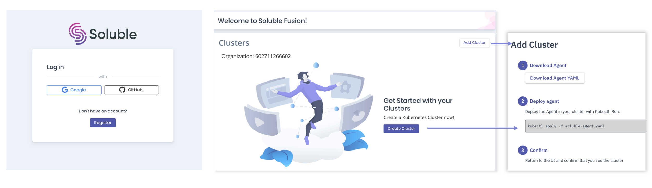
Soluble Fusion
Background
Soluble Fusion is a cloud security platform that automates vulnerability checks for developers and provides centralized visibility for security teams.
My Role
As the Founding Product Designer on a Series A team, I was responsible for:
Building the design function and culture from scratch.
Partnering with leadership to define product strategy and requirements.
Owning the end-to-end design and execution of all core features.
Key Deliverables
Led the end-to-end design for all Zero-to-One Initiatives, from foundational research to high-fidelity prototypes.
Architected and built the company's first Design System from the ground up.
Facilitated Strategic Workshops with leadership to define product roadmaps and align key stakeholders.
The Challenge:
Simple Mistakes, Big Risks
The #1 threat in cloud security isn't a complex hack—it's a simple misconfiguration caused by human error. It’s a preventable problem that has 75% of organizations deeply concerned.

source: labs.ripe.net
the Solution
A Safety Net for Your Team
We built Soluble to be the safety net for these mistakes. Our platform automatically finds and fixes misconfigurations before they become real threats, giving your team the freedom to build without fear.
Soluble is a SaaS product that uses DevOps to rationalize security in order to provide a faster and safer way for development teams to deploy code.
target Audience
Security Team
Development Team

Developers often struggle to manage large and dynamic security requirements, forcing them into a slow, one-by-one resolution process.

Security's lack of access and bandwidth hinders their ability to partner with developers and resolve issues efficiently.
Business Goals
Drive Deeper User Engagement
Increase user retention by 5%.
Increase task completion rate by 20%.
Accelerate New User Conversion
Increase overall conversion by 10%.
Increase new user sign-ups by 10%.
Constraints in the projects

Our Solution
Guided by our team's DevOps expertise and interviews with design partners at Snowflake, Amazon, and GitLab, our solution embeds automated security into the early code and test phase.
This "shift-left" approach empowers developers to identify and resolve issues earlier, enabling them to deploy code both faster and more securely.
Development Lifecycle
Developers
Instant Feedback: See security and compliance issues in your code before deployment.
Frictionless Permissions: Get the right level of access without the usual friction
Security
Centralized Visibility: Monitor org-wide risk and compliance from a single dashboard.
Granular Control: Enforce least-privilege access policies across the entire system.
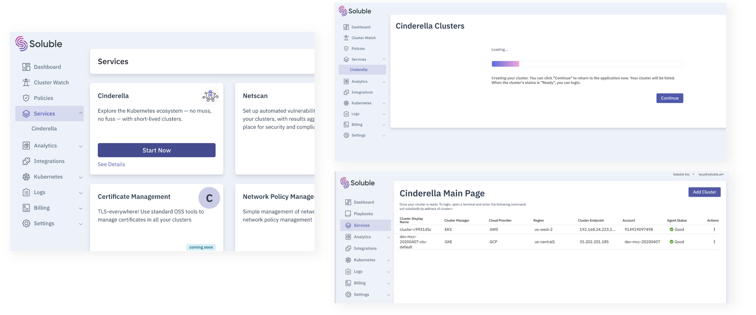
Soluble Information Architecture
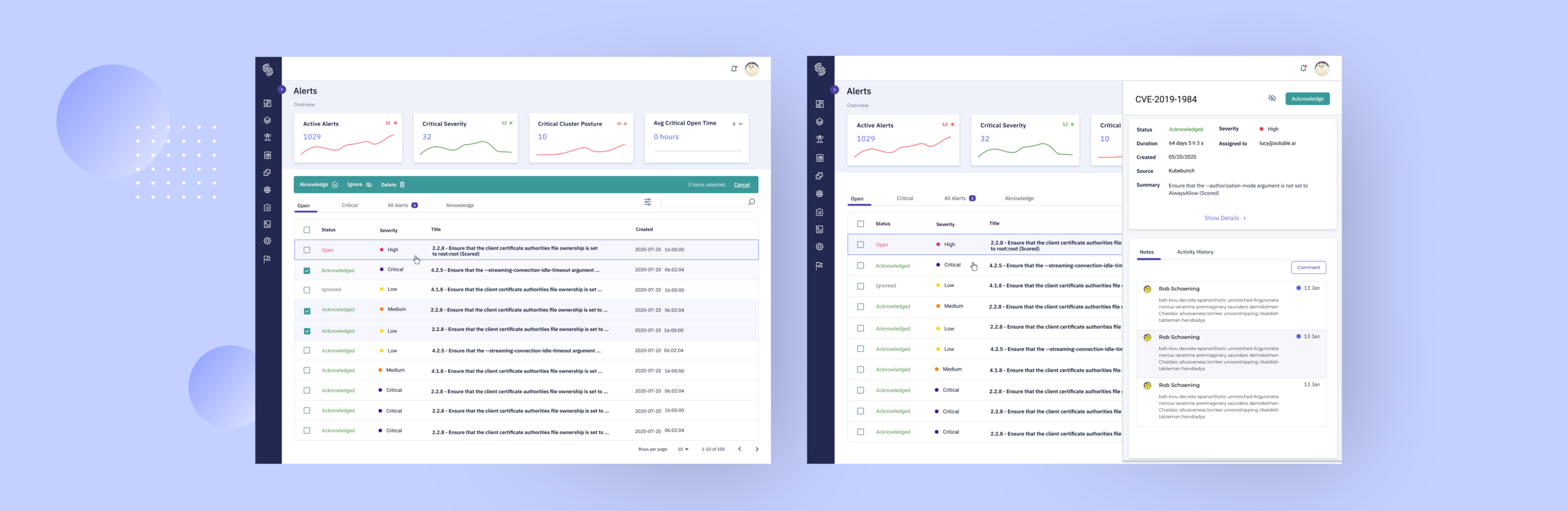
I designed the Cluster Watch alerts feature, which drove the most significant business impact and quickly became the primary tool for our developers.
Introduction
Cluster Watch (Alerts)
This first version of Cluster Watch was designed to give developers a clear, actionable view of all vulnerabilities and policy violations.
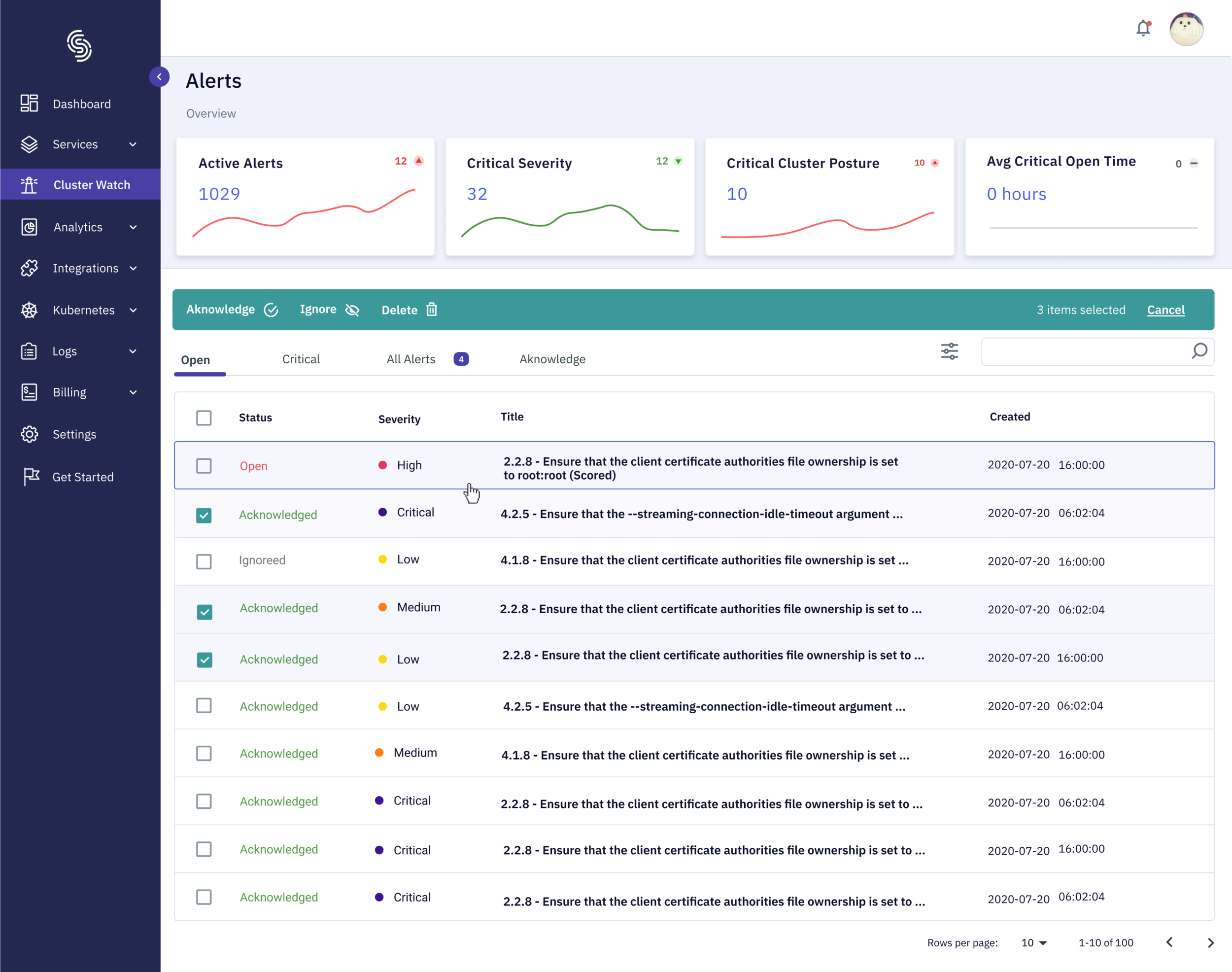
Before: Alert Main Page

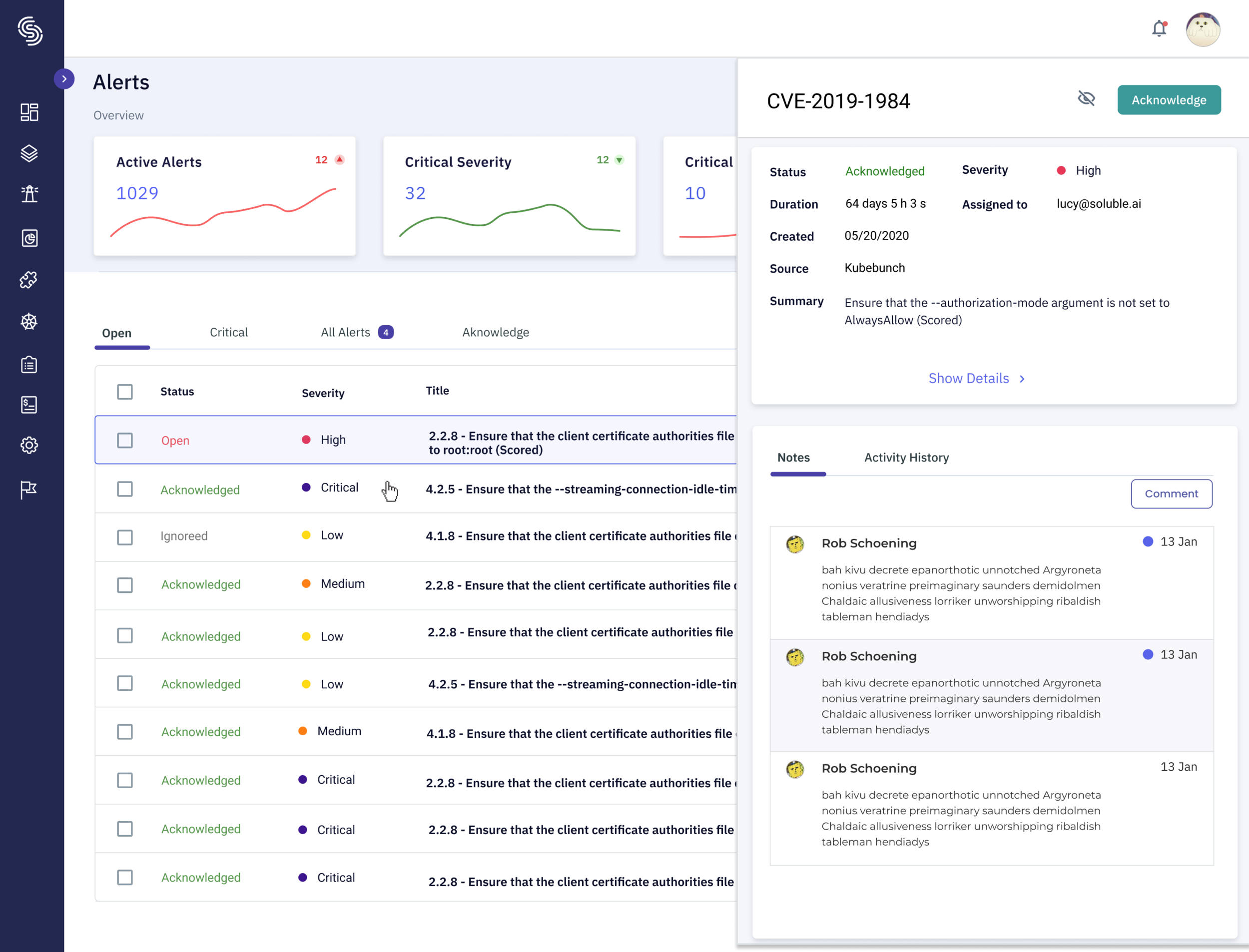
Before: Alert Detail Page
Insight Finding
Looking At Data
Sign-ups have increased by 10%
5 Design Partner signup
Users didn’t interact with the system again in 7 days.
Measuring 7-day retention is important to know if the user received the value that we provide.
SaaS products need to maintain retention to keep users engaged and bring value.
Asking the Right Questions
Why were users signing up but failing to engage with the product long-term?
User Feedback
To find out why users weren't staying engaged, my approach had two parts:
Qualitative User Feedback: I conducted in-depth interviews with six of our design partners, including teams at Snowflake, Amazon, and GitLab, to gather direct feedback on the V1 experience.
Internal Strategy Workshops: I facilitated brainstorming sessions with our product and engineering teams to synthesize the user feedback, prioritize needs, and define potential solutions.

User Painpoints
1. Onboarding Drop-off
Unclear instructions and a lack of guidance caused anxiety during the setup process.
Users feared making critical mistakes, often leading to drop-off.
Previous Landing Page
2. Visual Hierarchy: No Clear Prioritization
The interface failed to visually distinguish critical alerts from minor ones, making it impossible to assess risk at a glance.
The relationship between "Alerts" and "Monitors" was undefined, leading to user confusion..
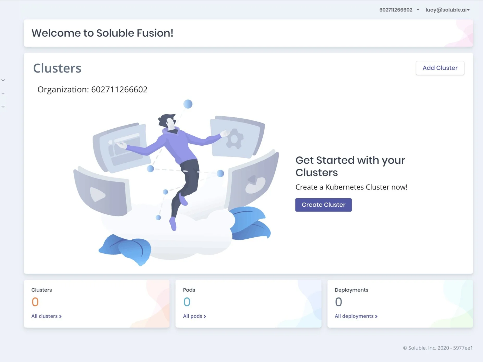
Previous Landing Page
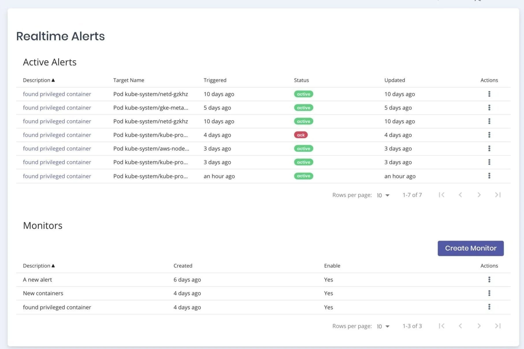
3. Alert Details: Lacking Context & Efficiency
Alerts lacked essential context, such as who configured a policy or when it was changed.
Cluttered layouts and slow navigation made investigating issues a frustrating and cumbersome process.

Previous Alert Main Page

Previous Alert Detail Page
Defining the problem
Alex's First Experience:
Let's consider the journey of Alex, a developer excited to try a new security tool.
She finds Soluble and, impressed by its promise, signs up immediately. But her enthusiasm fades when the first screen she sees is a technical "upload cluster" page. There are no instructions, no explanation of the benefits, and no clear next steps.
Her thoughts race: "Do I have the permissions for this? What if I break something?"
Unsure and intimidated, Alex closes the tab. In less than a minute, her journey went from excitement to frustration, and Soluble failed to convert an engaged prospect into an active user.

User Drop-off Story
Research & Strategy Definition
To ensure our solution was grounded in real-world needs, I led a comprehensive research initiative with three key components:
Qualitative User Research: I conducted in-depth interviews with 25 users from various companies to deeply understand their workflows, needs, and specific pain points with the V1 product.
Competitive Analysis: In parallel, our team performed a thorough competitive analysis to identify market gaps and define Soluble's unique advantages and opportunities.
Internal Strategy Workshops: The insights from both user and market research culminated in a series of workshops. Here, we synthesized our findings, defined clear goals, and began brainstorming and prioritizing potential solutions.

Design Solutions
A Choice-Based Onboarding
Our research showed user drop-off was caused by a lack of trust and context, not a lengthy process. Our solution, therefore, focused on providing immediate value through user choice and instant gratification. We replaced the single, intimidating setup with the freedom to either connect a system or explore a pre-configured sample environment. This "sandbox" path was designed as a quick win. In just two steps, users experience the product's core value risk-free and receive a success confirmation, immediately building confidence in a flexible and rewarding way.

Before - Onboarding workflow

After- Onboarding workflow
Our research found that the previous design left users overwhelmed and unable to prioritize. The new dashboard uses a four-quadrant layout to deliver a clear, at-a-glance view of critical security issues:
Active Critical Alerts – What needs immediate attention?
Alert Trends – Are things getting better or worse?
Top Violated Policies – Where are recurring issues?
Recent Activity – What’s changed recently?
This layout gives a holistic view of system health while directing focus to the most urgent risks.
A Streamlined Alert Detail Page
To fix the original page's slow and cluttered design, my solution focused on two key improvements:
Persistent Navigation: A new collapsible side panel allows users to instantly switch between alerts without ever leaving the page.
Prioritized Hierarchy: A prominent summary card at the top displays the three most essential data points—Severity, Summary, and Activity History—for immediate, at-a-glance visibility.
"Quick View" Drawer
To let users investigate alerts without losing context, we tested a full page, modals, and side drawer. The right-side drawer proved best—preserving the main list for fast navigation while displaying alert details.
To address the pain point of missing context, we added:
Collaborative Notes – A comment thread for team discussion and manual actions.
Audit Trail – A chronological log of all automated and user-driven activity.
This design maintains workflow continuity while enriching alert context.
Overview Section Iterations:

Alert Detail Options
Users want to be able to switch between alerts quickly.
Only want to look at 2-3 essential things:
Severity
Summary
Activity History

Final Design
In the end, based on collaborative discussion and internal test, we decided to go with right drawer option.
Overall Alert Experience Value
Additional Features: Notes
Redesigned the list component for clear sections
Comment sections to know who changed what and when
Additional Features: Activity history
Activity history for an overview of actions

Impact
Resolving the key onboarding friction drove a 39.25%
Increase in task completion
Guiding more users directly to the product's core value.
Design System
Driving Consistency and Efficiency
As a key contributor to the design system, I focused on bridging the gap between design and engineering. My role involved:
Driving Collaboration: Facilitating early communication by sharing interactive prototypes and leading design reviews to ensure all teams were aligned.
Streamlining Handoff: Establishing a clear process for developers, complete with detailed documentation and usage guidelines for all components.
Designing for Scale: Creating and documenting core UI components with a focus on consistency, scalability, and technical feasibility.

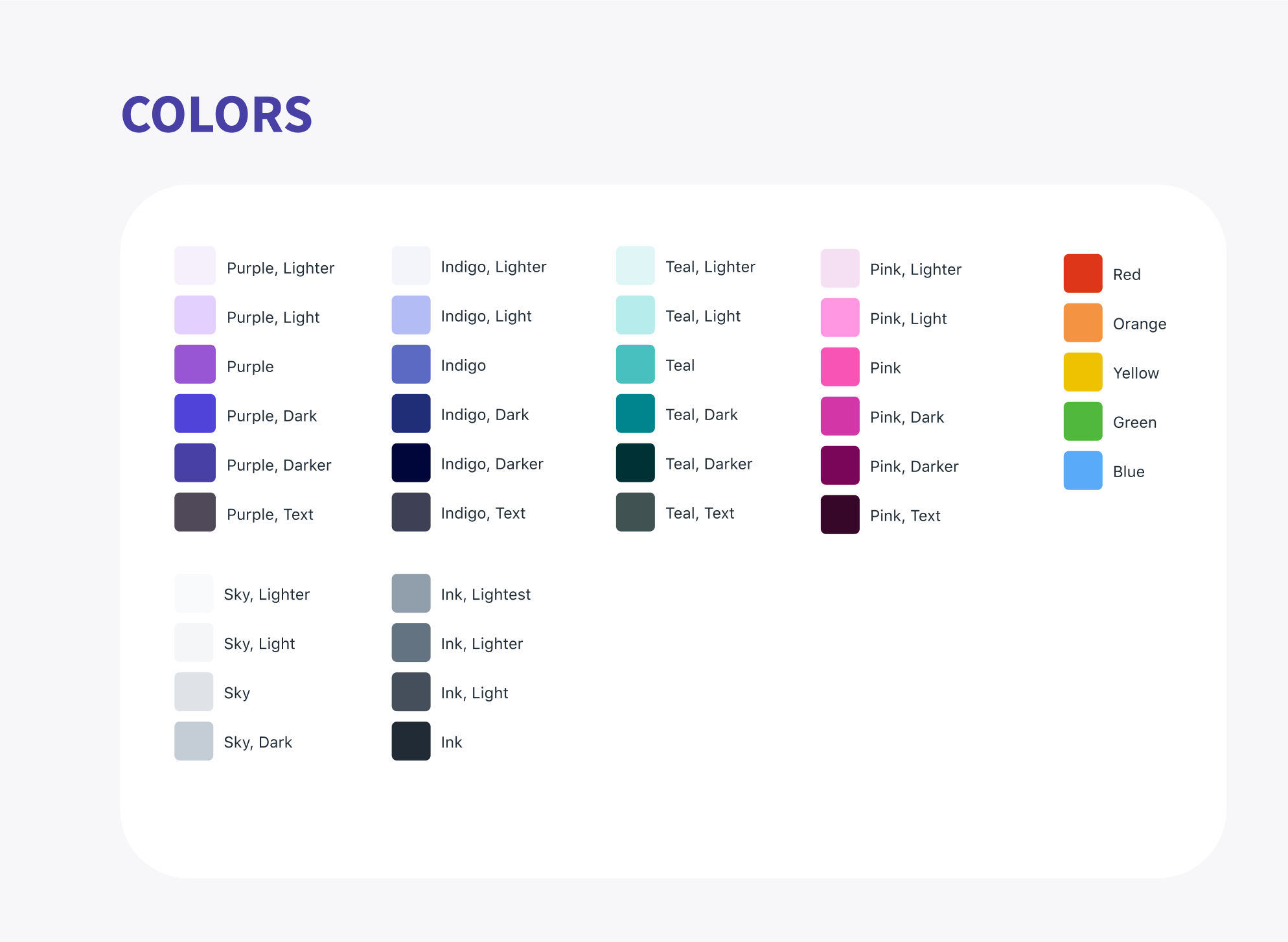
Color Palette: Building Trust and Guiding Action
Our color strategy was designed to feel professional and trustworthy while guiding users effectively.
Primary Purple: A deep purple was chosen as the core brand color to establish a stable, modern, and professional feel that differentiates us from the typical "tech blue."
Action Green: Green was reserved for all primary call-to-action (CTA) buttons. This leverages established UI patterns where green signals "Go," "Success," or "Confirm," creating an intuitive path for users to follow.
Typography: IBM Plex Sans
We selected IBM Plex Sans as the primary typeface for its blend of technical precision and user-friendly clarity.
Legibility & Clarity: Its high legibility at both small and large sizes is crucial for ensuring that dense information—from data tables to code snippets—is always clear and easy to read.
Visual Hierarchy: The variety of available weights was used to establish a strong, scannable hierarchy, helping users distinguish between headings, body text, and UI labels.
Brand Alignment: The font's clean, engineered aesthetic aligns perfectly with our brand's attributes of trustworthiness and precision.


Daily Digest + Email Templates


Thanks for YOur time.